
 Image: Helen O'Meara
Saturday, October 31, 2009
Friday, October 30, 2009
China blue
Little Green Notebook is one of my regular blog reads and full of great ideas and inspiration. I do feel a bit slow and inadequate as Jenny flies through her home projects at alarming speed. This Chiang Mai fabric is a favourite of hers - in a brighter blue orange colourway so I had a look at Schumacher fabrics to see other colours as I love the pattern and here it is (a bit more me) in all the blues. Schumacher fabrics are available here in Australia.
 Image: Schumacher
Image: SchumacherWednesday, October 28, 2009
One Thread
Beautiful fair trade pillows from One Thread. These are made in India and come in jewel colours and silver and gold if you look through the site. One Thread's aim is to help marginalised artisan workers take their products to market in a way that is beneficial to the individuals .
 Image: via BLTD
 Image: via BLTD
Tuesday, October 27, 2009
Kitchen classics - painted Ercol
As if I needed more classic chairs to consider for my kitchen area along comes the revival of Ercol style high backed chairs and armchairs to add to the mix. I already have Wishbones, Thonet and Eames on my list of possibilities. Although some people really hate seeing wooden furniture painted I am open minded on this topic and - if it means that fewer old chairs end up on the scrap heap, all the better. I think what I need to do is a comfort test for all my options as, after all, looks are not everything.


 Images: Trent Bell via Desire to Inspire, Brown and Orange, Elephant & Monkey
 Images: Trent Bell via Desire to Inspire, Brown and Orange, Elephant & Monkey
Friday, October 23, 2009
Metafora
Look at this for a vanity and sink - its not big on storage with just one hidden drawer underneath but so glamorous, perfect for a powder room where really only a few hand towels are required. Metafora by Artelinea is Italian of course and is fashionably decked out in the Pantone Colour of the Year Mimosa Yellow. The vanity comes in black and white and you can choose the colour of the glass top.


Images: Artelinea
Thursday, October 22, 2009
Designing rugs
Posting has been a bit sporadic lately as I am head down on coursework to try to get up to date for the start of term next week. One of our assignments is to design contemporary rugs for Designer Rugs ( purveyors of amazing rugs by amazing designers . . .). This is one of my entries - Ned. Its a bit tongue-in-cheek, the idea being that you think you have a big plain rug with a splash of colour in it but really you have a big Ned Kelly head on your floor. I had just done this when the first issue of Lonny came out - check out this great online magazine if you have not done so already and I saw a NYC apartment designed by Ron Marvin that would suit my Ned rug down to the ground (pardon the pun).

 Images: Sheila O'Meara, Lonny

 Images: Sheila O'Meara, Lonny
Tuesday, October 20, 2009
Storing cookbooks
I get so many fantastic ideas by browsing design blogs and this is one of them. I already own cookbooks that extend to well over a metre and a half on book shelves and the other thing about my books is that they are very heavy when you put them all together. While I do like shelves set into kitchen benches for books I thought this idea of using a vertical shelf in a pantry is genius. Whoever owns this pantry even has some cookbook series grouped together - very organised.

 Images: via Fric and Frac, Aero Designs

 Images: via Fric and Frac, Aero Designs
Friday, October 16, 2009
Texture in pink
As I lived in London for many lovely years I am still on Habitat's mailing list and they have definitely increased their digital marketing as they are sending out lots of inspiring emails. Always into a splash of pink (I grew up with all boys and now live with all boys so I have to make some mark in the house) I spotted the Tempe throw folded on the sofa here. It's well priced and I like the colours and pixellated look which makes it quite a masculine pink throw.

 Images: habitat

 Images: habitat
Wednesday, October 14, 2009
Keeping it real
As an aspiring interior designer I keep an eye out for creative solutions to practical decorating challenges. Out in the real world when people are decorating their homes there are always pillars and beams and columns to contend with. Here the stylists FriedaMaria have made a feature of this quite large column in a very understated way which addresses the column but doesn't overly emphasise it in the room. The wallpaper makes it look like an artwork. An old post from last year here shows another column idea.


Image: styled by FriedaMaria via Emma's design blog
Tuesday, October 13, 2009
The Smell of the Sea
I first saw this print at the Young Blood Designers market earlier in the year where the Bespoke Letterpress Boutique was selling its beautiful letterpress cards and prints. Loving the fish I hopped from foot to foot, will I? won't I? and because the market was really busy I thought I'd better keep moving and decided - I'll get it online.
So I checked in from time to time but it was never there until yesterday I got wind of The Bespoke Illustrators Project and there it was. 'The Smell of the Sea" is by Ines Fernandez, all the details of this great initiative are there if you follow the link and if you leave a comment you get a chance to win the prints including the fish.

 Images: Bespoke Letterpress Boutique
Monday, October 12, 2009
Favourite houses: James Robertson House
There are areas of Pittwater about 40 km from Sydney's centre where people live on bays and beaches that are only accessible by boat. Many commute by tinny or ferry to Palm Beach and on into the city to work. This house is one such house. James Robertson house is an award winning design by Dawson Brown architects on Great Mackeral Beach. It is built right into the rocks in a series of pavilions - this only a selection of the images available - google James Robertson house if you want to see more about the building. Love the views and reflections. The sculpture over the dining table is an aboriginal fishing basket.

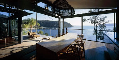


 Images: Architecture.com, Casey Brown, Belle Magazine


 Images: Architecture.com, Casey Brown, Belle Magazine
Sunday, October 11, 2009
Tip of the day
Reading one of those '500 designer tips you you should know . . ' type of articles, one suggestion was to paint the wall behind a collection of pictures or objects in a dark shade for added impact. Especially good if you have a collection of black and white photos to display.


 Images: Heiberg Cummings, via Mrs Blandings, David Prince via Desire to Inspire
 Images: Heiberg Cummings, via Mrs Blandings, David Prince via Desire to Inspire
Wednesday, October 7, 2009
Blue is for girls
This kid's bedroom is by Lotus Bleu - designer Jeannie Fraise - who also has a shop and online shop here. You do increasingly see kids bedrooms that are a bit more thought through with parents buying furniture and soft furnishings for the long haul rather than buying too much purpose built 'kids' furniture and (my pet hate) Ben 10 or Barbie duvet covers etc.
I love the colour scheme and fabric choices here - it is still girly (even though the walls are blue) and suitable for a young child - but who wouldn't be happy with those cushions in pretty much any other room in the house when she is ready to put her own mark on her personal space ? Smart choices in my view.

 Images: Lotus Bleu
Tuesday, October 6, 2009
Third in show
I love an awards ceremony so I flicked through the prize winners of the UK Homes and Gardens 2009 Fabric Awards. How the judges choose I do not know given the huge ranges of new fabrics and wallpapers that are issued each year and so many gorgeous designs to choose from. The Lotus papers by Farrow and Ball below came third in the 'blow the budget best wallpaper category' . It comes in a huge range of colours - some subtle and some dramatic - and they have pictured it with my favourite Pols Potten chair.


 Images: Homes and Gardens, Farrow and Ball


 Images: Homes and Gardens, Farrow and Ball
Friday, October 2, 2009
Holiday weekend
I'm off to the country for a few days as it is a long weekend here. The weather forecast is a bit mixed so we're packed for all eventualities (reminiscent of holiday in Ireland packing -swimmers and fleeces). There is not much in the way of broadband where I am headed so I'll be back next week. Enjoy the weekend !
 Image: Ferm Living
Thursday, October 1, 2009
The China Syndrome
I can't really explain it but I get a great kick out of all the recent projects reusing china and plates like the immense wall of plates at Milan Design Week and the 're-purposed' plates and cutlery at Eat Green Design. The recycled old saucer butterflies by Lightly are so more-ish I just want to buy them all whenever I see them.
So this photo caught my eye as I am a committed utensil rail person and what better way to get with the trend than to hang some pretty china from my existing rails ? I could actually do with a nice sauce boat as last weekend we ended up serving a sauce directly from the pyrex jug it was made in due to lack of suitable equipment . . .


So this photo caught my eye as I am a committed utensil rail person and what better way to get with the trend than to hang some pretty china from my existing rails ? I could actually do with a nice sauce boat as last weekend we ended up serving a sauce directly from the pyrex jug it was made in due to lack of suitable equipment . . .

Images: Emma Mitchell via Desire to Inspire, Lightly, Megan Morton via the Design Files
Subscribe to:
Posts (Atom)


